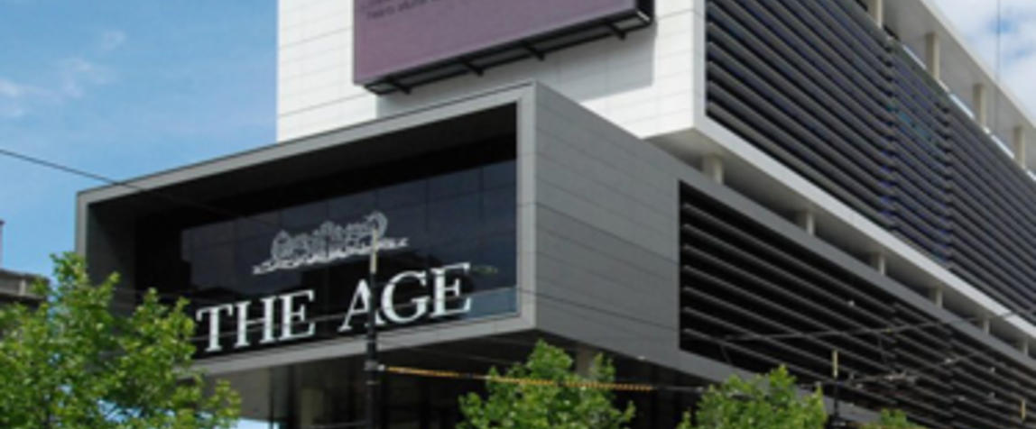
Fairfax has unveiled a new website for The Age which encompasses a fresh new look for readers and cleaner ad units for greater impact. The revamp is part of Fairfax's company wide upgrade of its online news sites, which began with the Brisbane Times website back in August, and will finish with the Sydney Morning Herald later this month.
The Age's new digital platform aims to deliver a faster news experience, immersive storytelling and advertising innovation across mobile, desktop and tablet. A feature named 'shortlist' allows readers to queue articles and switch between devices throughout the day to enjoy a seamless reading experience. Longer story introductions means that content discovery is improved too.
In terms of advertising, the new website offers a more collaborative environment for clients with the ability to submit rich media ad formats like VR, AR, AI, voice and 360 video.
“We launched the new ad units which were simplified but clearly had a much higher impact and immersive qualities. What we found is they worked better on the newer Brisbane Times sites,” Fairfax chief revenue officer Matt Rowley told Mumbrella.
“The first design we tried had had a horizontal feel in mobile. It was more of a swipe across. What we found was that people thought we were keeping stories from them so now there’s much more of a vertical feel to the top stories so people can see more content, more quickly," he continues.
Unlike the Brisbane Times, The Age and the Sydney Morning Herald have print editions and both have gone through redesigns that were consistent with the upgrade of the websites.
“We updated our print design in both the SMH and Age to reflect the visual language we put in place on the website back in December last year. We actually went through the process of stripping out elements, we changed the font to Abril that we also use in digital that we also used in print,” Rowley said.
“If you look at the websites you’ll see a clear relationship. With the newspapers, people are really rusted into their habits so you only want to move things bit by bit. It’s subtle but in terms of the colours, the fonts and in terms of using white space the more similarities you’ll see.”