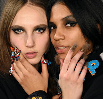
Is it what’s inside that counts? Not so for the beauty world, a $US260 billion industry built upon pure consumer appeal. Like any market, individual brand success is not just based around how good the actual product performs, but how well it can also subconsciously seduce shoppers. There’s a reason packaging design is big business, with many brands - including and O&M - employing the likes of major creative studios like Sydney’s Container Made to craft iconic packaging for their products.
The key to enticing shoppers in a saturated market lies in packaging design - a factor that shouldn’t be underestimated - according to the handful of brand experts who have explored the role packaging plays below.
Make a good impression
Beauty is booming, with new products and brands arising every second. The only opportunity brands get to make a memorable impression on the consumer, as well as stand out against competitors, is via first glance at its design.
To put it simply, brand manager Nicole Butkiewicz explains: “Products should be eye-catching on shelf and easily shoppable in a saturated environment.” Courtney Sims from Formula 10.0.6 agrees: “Our packaging must be designed to instantly appeal, driving them to pick up a product, engage them to learn more and ultimately make the choice to take us home,” she says. But seduction must be instant she believes, commenting: “Consumers are more time-poor than ever so brands must find a compromise between uniqueness and ability to communicate their brand message.”
’s Matt Gillman continues: “Packaging is the first thing the customer sees, they instantly will receive a connection or an idea to the contents of the package through the style of the packaging.” In an instant glance, packaging can provide shoppers with an understanding of background to a package without the need for words - exactly what it is, and who it is intended for.
But frank body director Bree Johnson deliberates that not only is design integral for representing the product, but also the brand’s ethos. She says: “People like pretty things that work well. Packaging has the role of not only being a representation of the product itself but also the brand. How the product feels in your hand, how it looks on your shelf, how it photographs is all a key part of the brand experience - so it’s very important.”
Know your niche
Considering the current saturation of the beauty market, standing out from competitors is easier said than done. The key is to know your target audience - it goes without saying that age and gender play a large role in design factors of colour, text, imagery and even material. Determining who exactly a brand’s target audience includes is integral to be able to convey a strong brand image to consumers.
Understanding of the consumer was paramount to ’s designs. Sims describes the brand’s target market: “They have high disposable incomes and are very mindful of their own brand and surround themselves with products that reflect their personality.” It’s a fact that directly impacted their choice of design in every aspect, including a penchant for vibrant colour palettes, and cheeky text. “Each product features text in a different monochrome colour, creating a rainbow when products sit together on [a] shelf or in the bathroom. Our typography is arresting showcasing the fun you can have with fonts. Finally, tone is a key consideration. Formula 10.0.6's packaging reflect a young, fun and uncomplicated approach to skincare that speaks directly to the consumer and their needs. [It says] skincare doesn't have to be boring!”
Lip Smacker is equally aware of its young demographic, with the brand explaining its design focus was determined by its target market of tweens. “When it comes to package design, pattern, imagery, size and collectability are the key focus areas for Lip Smacker. Collectability is an important factor for our target market, so our limited-edition packaging is often reusable.”
While adhering to a vastly different clientele, HANDSOME has also employed an approach that sees it project a strong brand image that mirrors its intended audience. Favouring a minimalist approach, the men’s grooming line is directly reflective of its target market - a sleek, modern gentleman who takes care of himself. Gillman explains: “The main focus for HANDSOME is keeping things true to our values, we went through an extensive branding exercise when first developing [the brand] and made sure our values were very clear. They include simplicity, classic, mysterious - those three values come across very quickly with the brand.”
Material world
Once the demographic is determined, targeted design is possible. Material can be just as vocal as any of the other design factors, as specific materials determine age bracket, as well as price bracket - the more expensive the product (in general), the less expense spared on its outer shell.
For Mintel analyst Benjamin Punchard, chosen material is particularly important for prestige brands. He explains: “A lot of pack types are very similar, so prestige beauty needs to make itself unique. It is important to create a brand memory through consumer experience - which packaging can create. Packaging can create a moment of discovery of engagement. It adds value.” This is because material, like all factors of design, filters into brand representation - a consumer expects a luxurious product to be housed in luxurious packaging.
But the most flamboyant of materials is not always essential for creating a consumer experience. Standing out from the market is now often related to thinking outside of the box. One example is - a brand renowned for its simplistic, tongue-in-cheek approach to its body range. Johnson says their choice of material not only served a function purpose but fed directly into the brand’s message to consumers: “Our first product looked like dirt in a brown bag. We knew we couldn’t dress it up or be too fancy. There are plenty of luxurious, elegant beauty brands out there with extravagant high-end packaging but that’s not us. We are frank. So instead of trying to compete with them we own our own space. For that reason kraft is a big part of our packaging design. Similarly when we were designing the face range, body balm and body cream we kept the design simple and playful.”
Different materials are also employed by most brands as a way to differentiate between the different price brackets within their range. For Lip Smacker as an example, Butkiewicz says: “Material helps to distinguish between entry level and more premium products. For instance, tins and thick board display boxes demand a premium, whereas felt bags are used for our entry level offers.
Tricks of the trade
For brands in doubt, Johnson says it is the brand prerogative to get in contact with its intended consumer. “Talk to your customer. With platforms like Instagram, Facebook and Twitter it is even easier to communicate with your customer or potential customers. Don’t be afraid to make changes, ultimately you have to roll something out and see how it goes, if it’s not working for you look at why that might be,” she says. Whoever your audience and whatever your design intention, Gillman believes one thing is key to crafting quality packaging: “Don’t overcomplicate things,” he says. “Don’t fill up space because it’s empty. It’s ok to have empty space… just like you don’t need bass solos in rock and roll songs.”
Image: Smallbiztrends.com